Promotional materials developed during internship for the Mint Museum's exhibition of Inventing the Modern World: Decorative Arts at the World's Fairs.
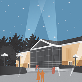
I was asked to create an illustration for the Randolph facility to complement the illustration made for the downtown location. Both illustrations were utilized across a variety of medium (print and digital) to promote the exhibit.
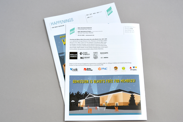
Illustration of the Mint Museum, Randolph by Lori Lennon.
Illustration by Lori Lennon as shown in Mint Museum newsletter (newsletter layout by E. Frederick).
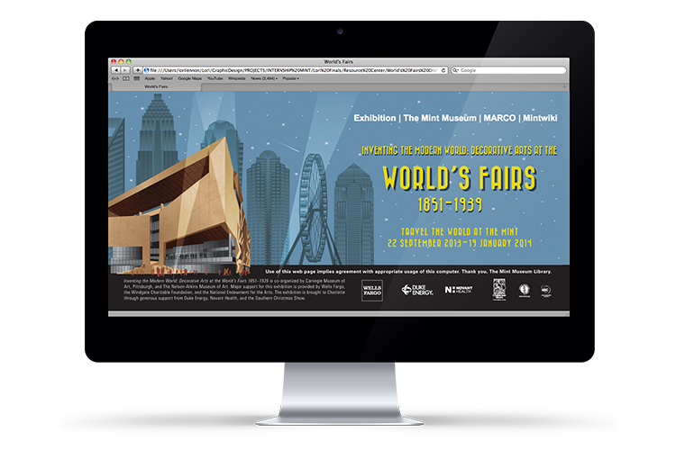
Website landing page mockup for the exhibition. Layout by Lori Lennon (illustration by TJ Winecoff).
Invitation and access sticker for the opening of the exhibition.
The invitation included perforated postcards the recipient could use to help promote the event.
Layouts by Lori Lennon (illustration by TJ Winecoff).
Magazine advertisements.
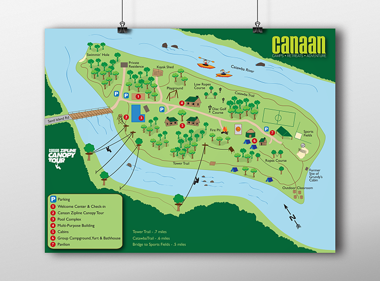
Marketing materials developed during internship at Camp Canaan: illustrated map, brochure, and rack card.
Responsibilities also included web site (Wordpress), photography, and web banner development.
Map of the Camp Canaan island and its amenities.
Website banner image and page featuring map.
Camp Canaan marketing materials: tri-fold brochure and rack card.
Camp Canaan tri-fold brochure.
Camp Canaan rack card, placed at SC Welcome Centers.
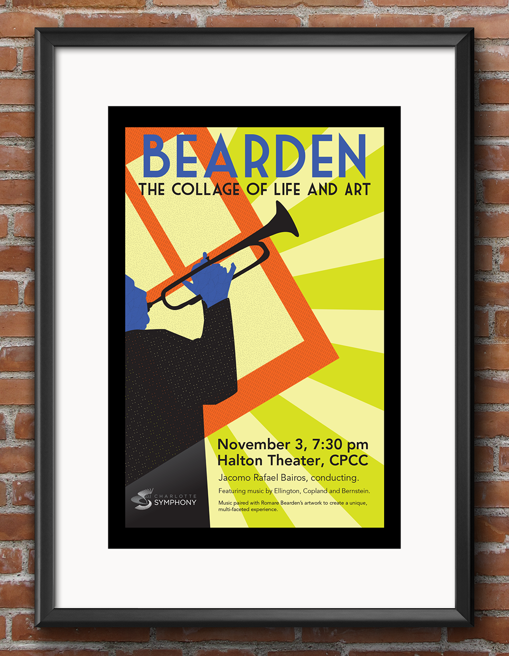
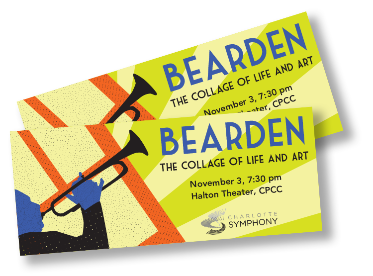
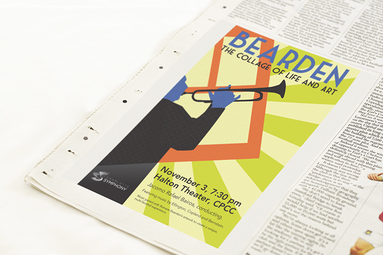
Promotional materials for the Charlotte Symphony Orchestra to promote a concert that celebrated artist Romare Bearden's 100th birthday.
Poster concept.
Ticket concept.
Website page concept.
Newspaper advertising concept.
Senior thesis project.
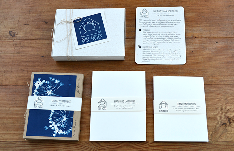
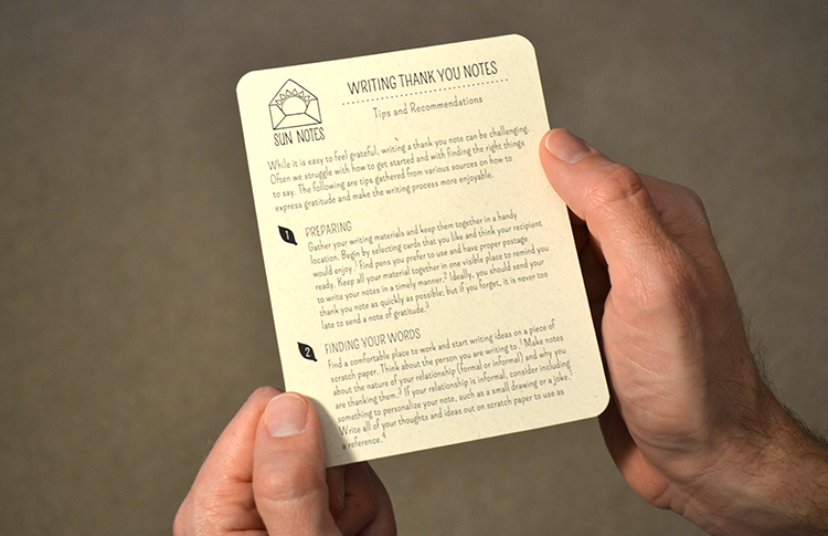
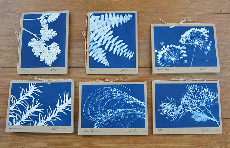
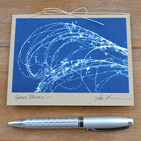
A set of hand-made cards and writing recommendations for thank you notes. Cards were made using a cyanotype print technique, which utilizes a UV light sensitive paper to create the image.
Concept design for light bulb company ‘Creature Colors’
Brand naming, illustrations, and package design developed.
Branding concept for the Mecklenburg History Trail.
A quilt-based icon was created to convey the concept of family, tradition, and the history of the cotton industry in Charlotte.
Original photography was used for the brochure.
Advertising concept for Visitnc.com to increase awareness among in-state travelers about how close the NC Mountains are to urban areas.
Concept for Twitter 2013 Annual Report
Designed to communicate how Twitter provides a platform for individuals to express themselves and engage with others who share similar interests.
Original photography was used for front cover as well as two of the inside spreads.
Portier is a hand-made typeface designed as a tribute to a sign found above a doorway in Amsterdam.
Nine of the existing letters were used as a basis for this display typeface, which can be used in applications such as print, labeling, and signage.
Copyright © 2025 llennondesign. All rights reserved.